Volume
Pump up the VOLUME 🎧 🎵
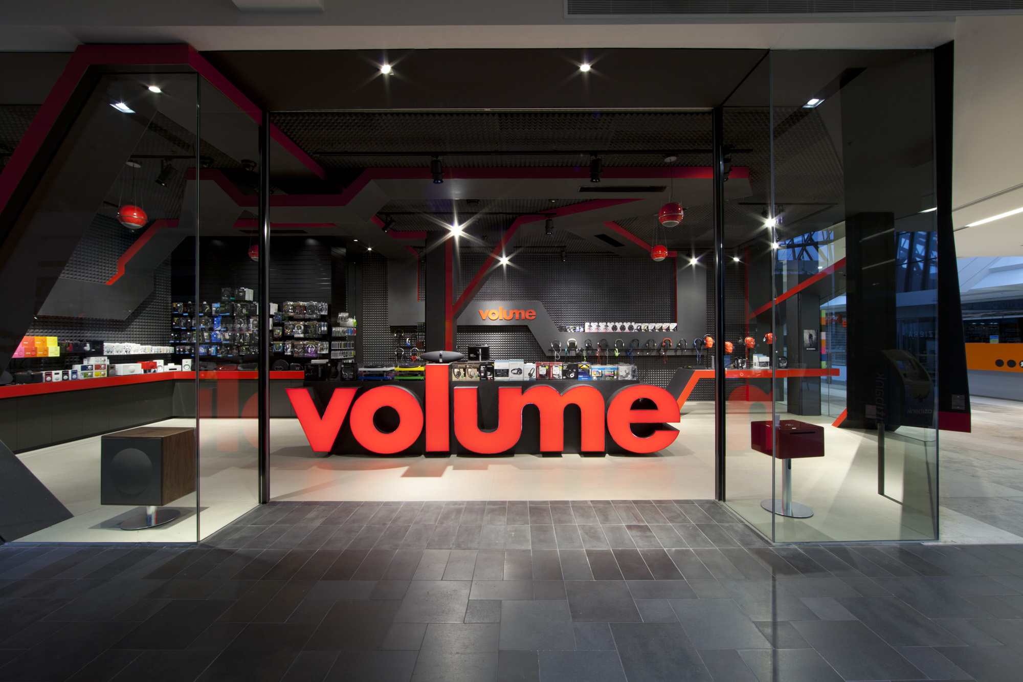
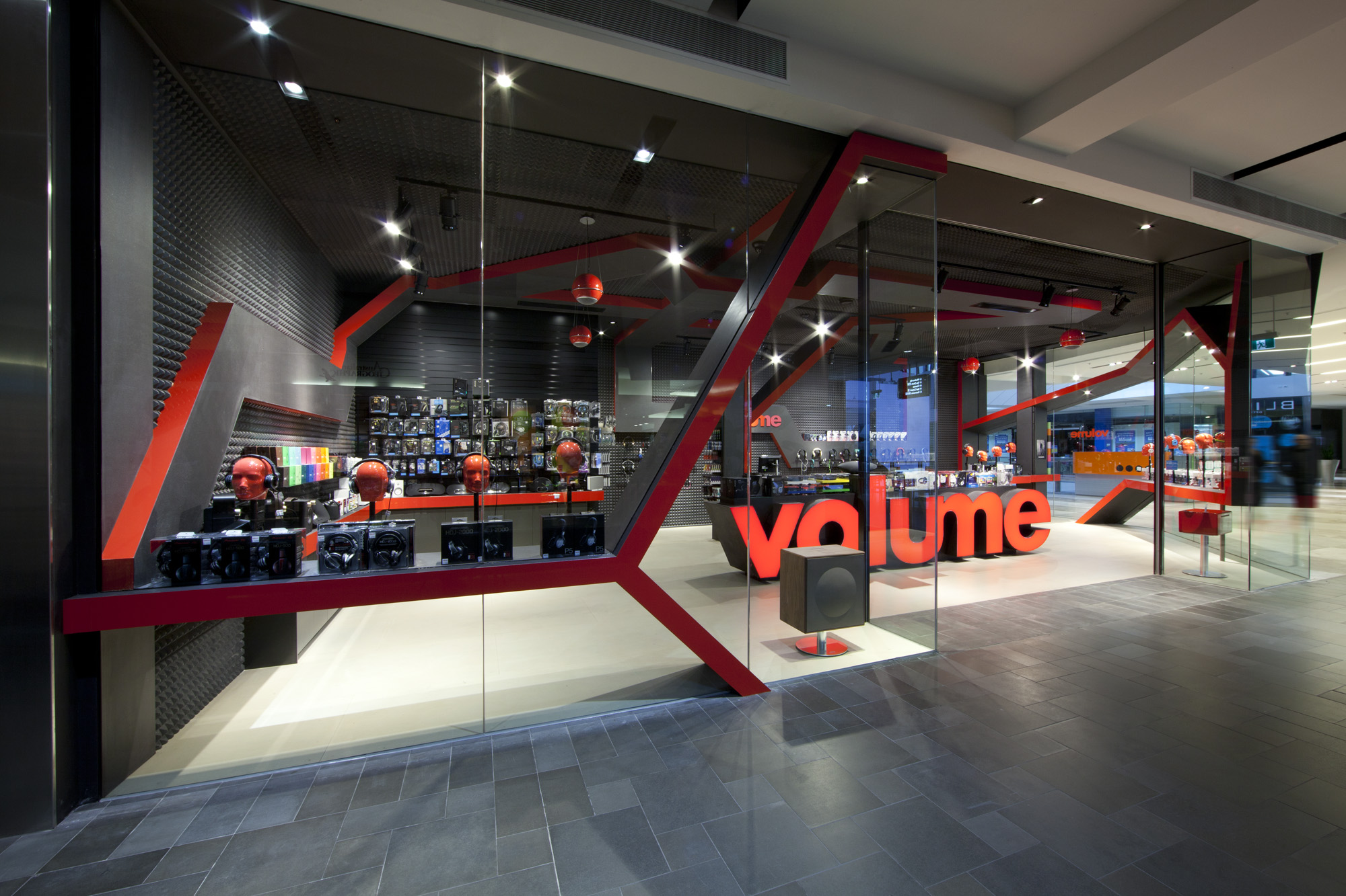
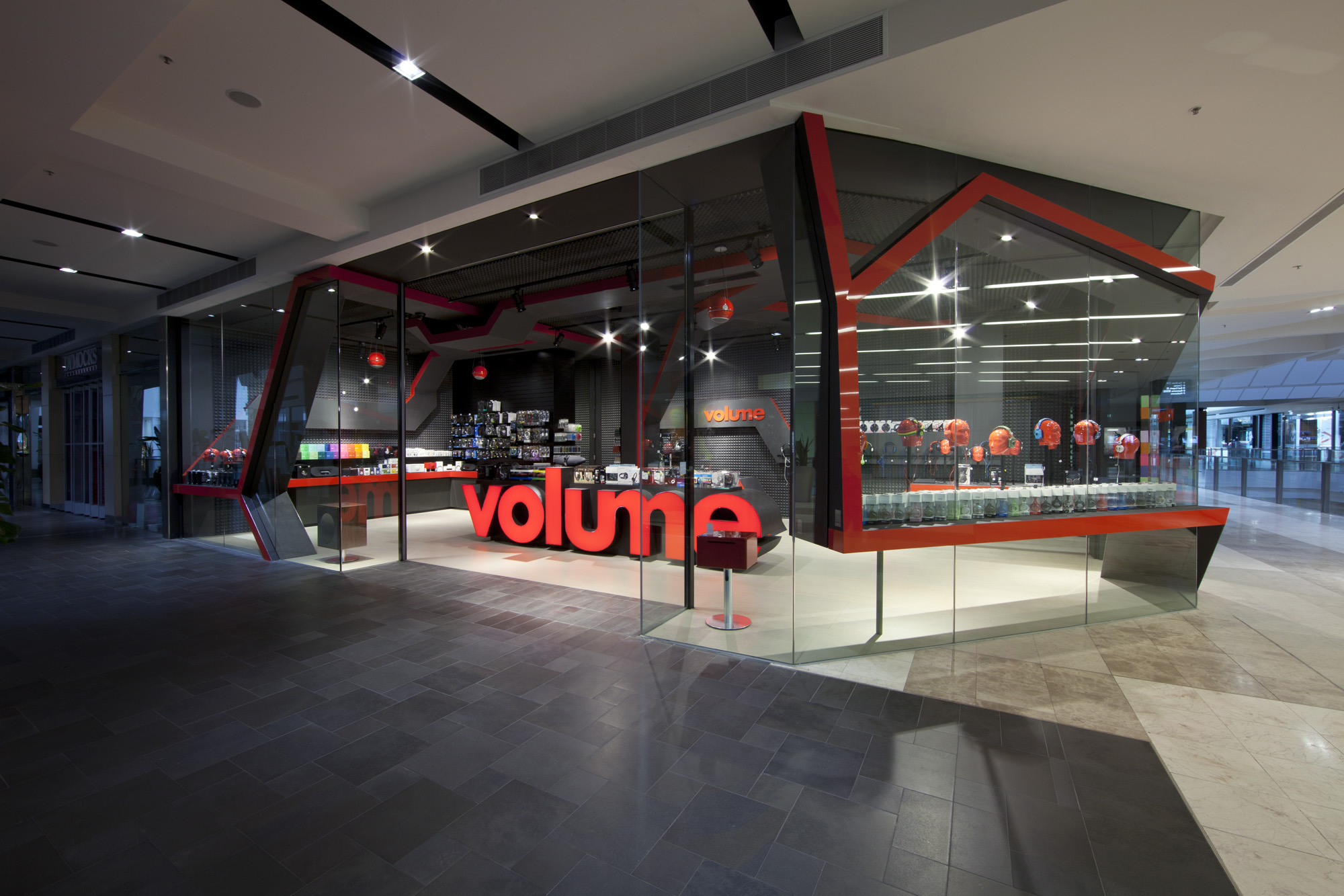
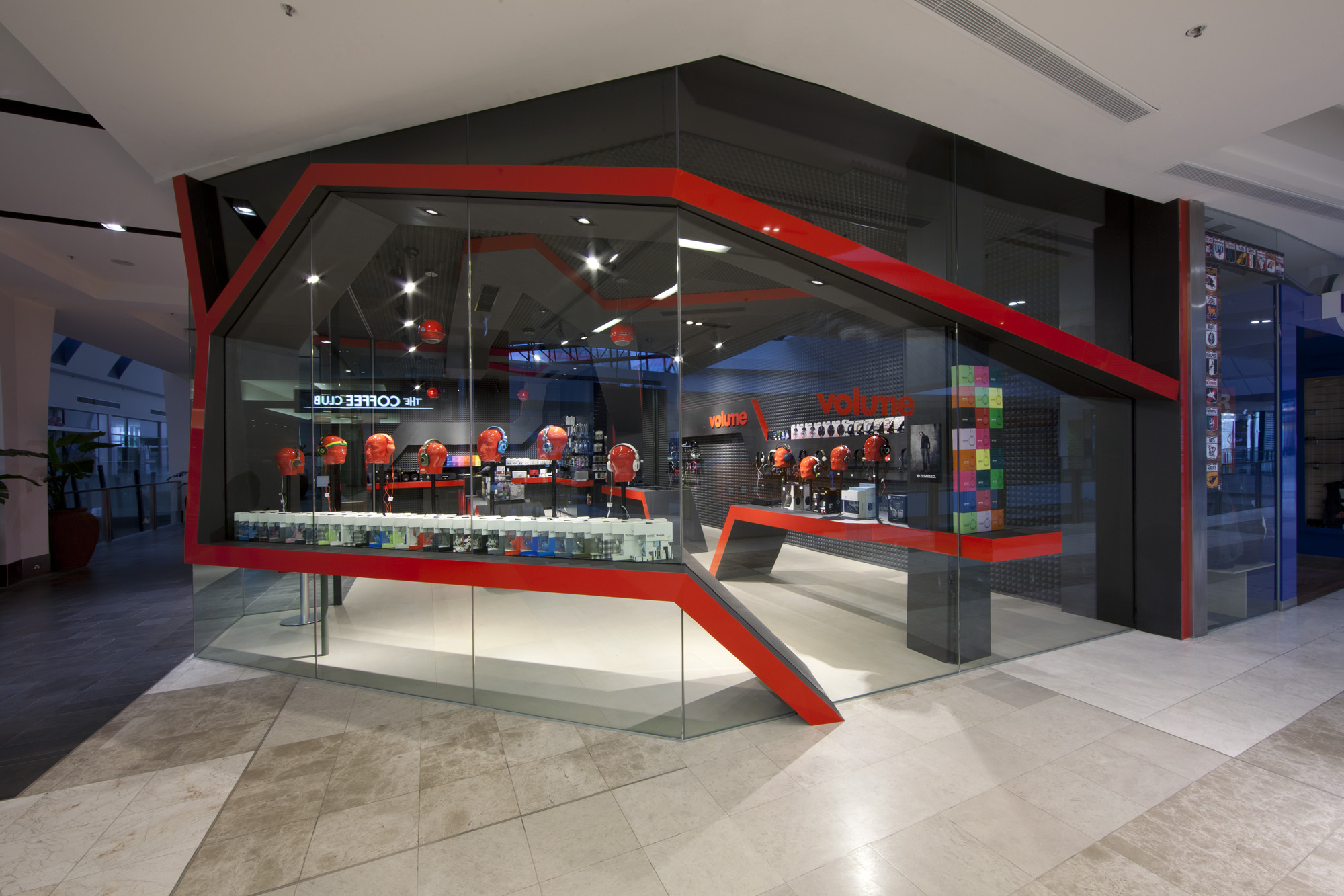
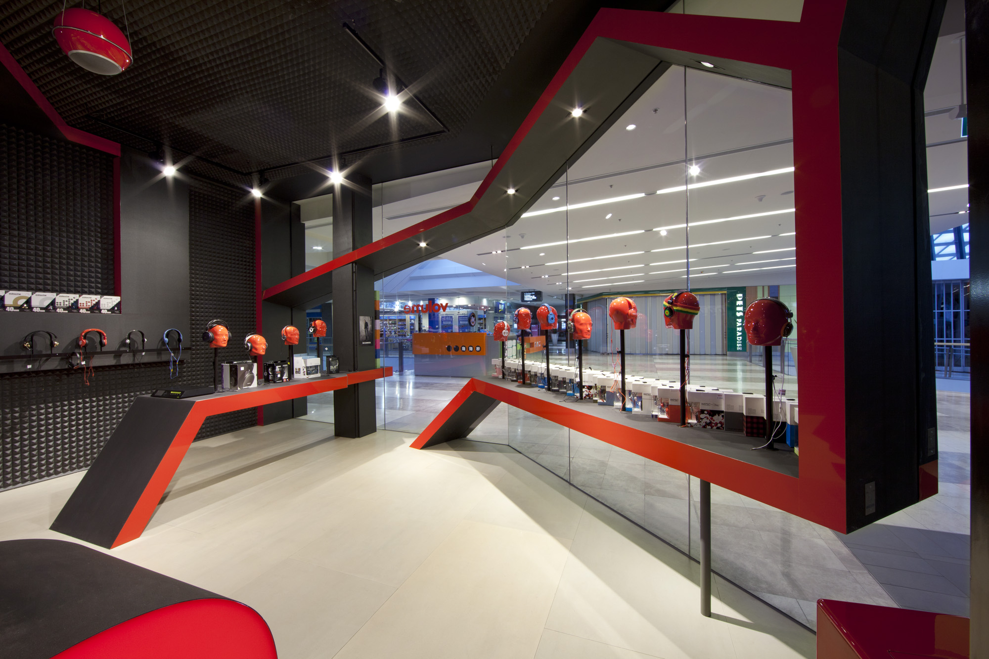
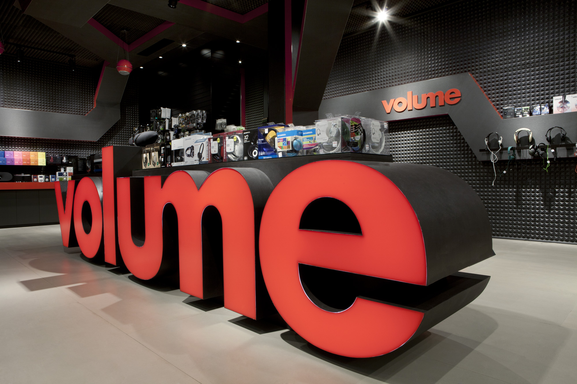
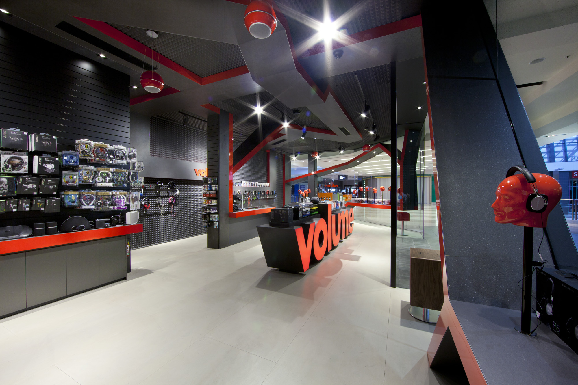
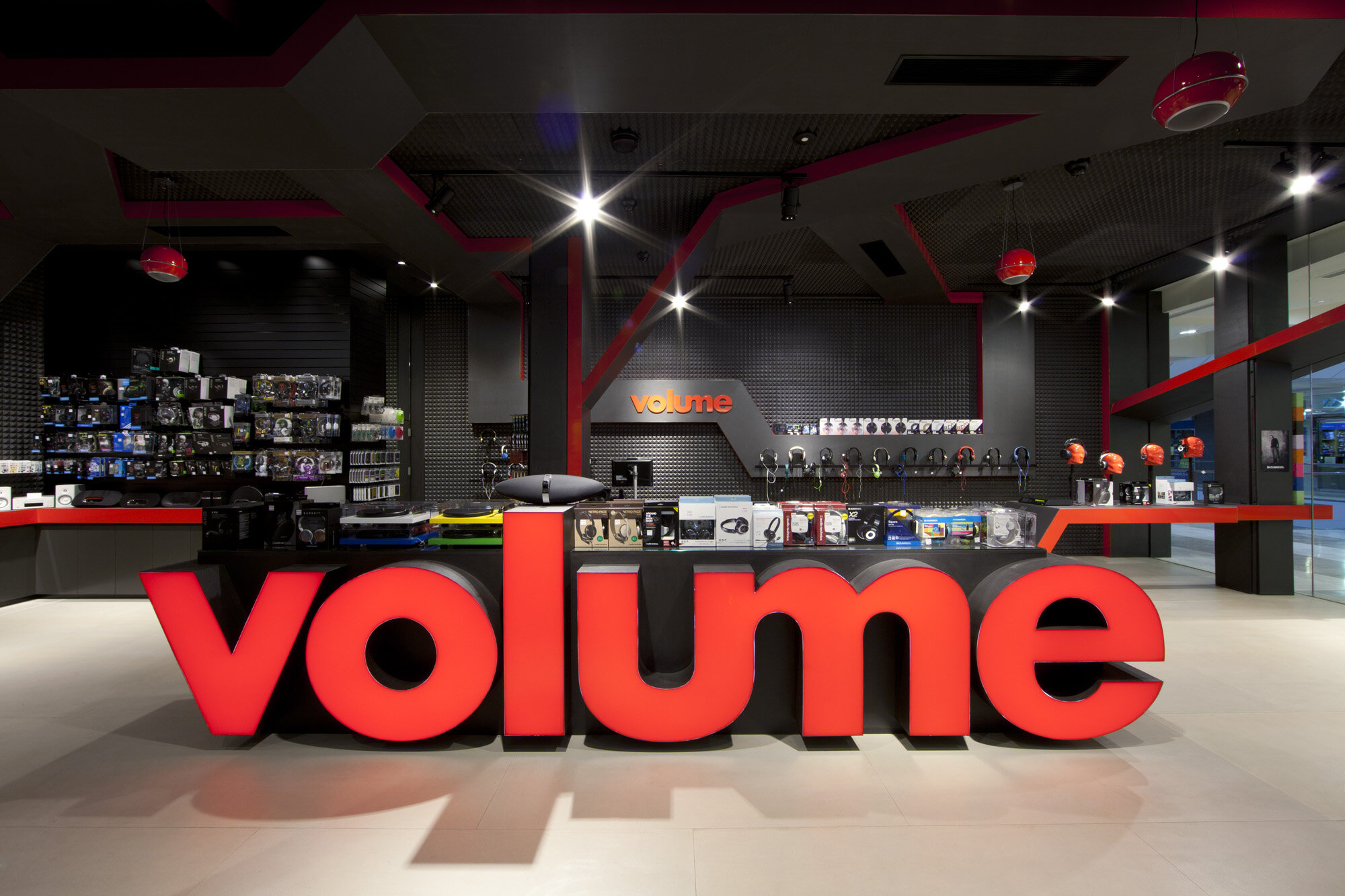
This store design screams impact, cutting through the visual noise of the shopping mall like no ones business, completely owning the corner tenancy site!
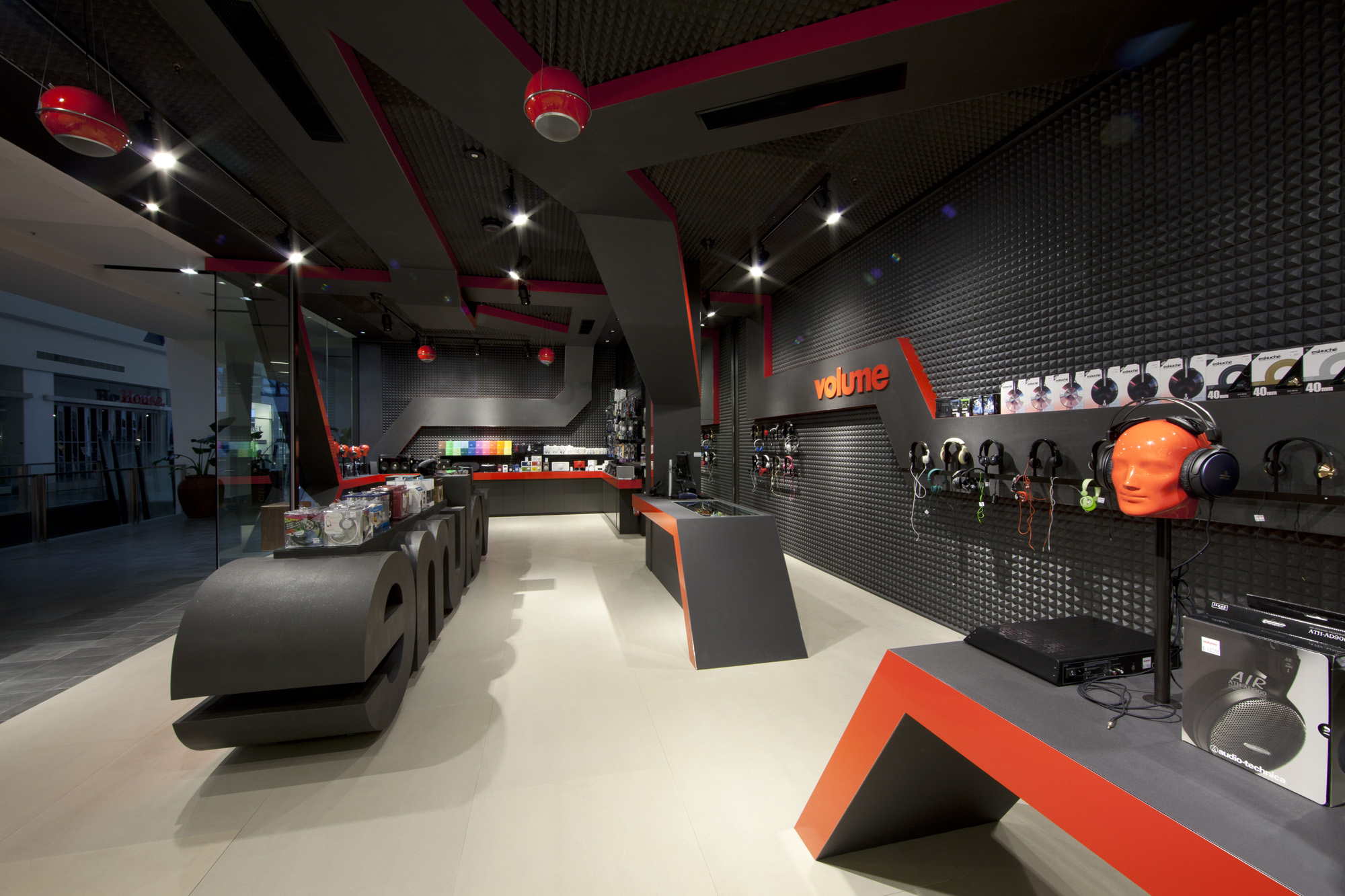
The entire store design is a 3D masterclass in form and function;
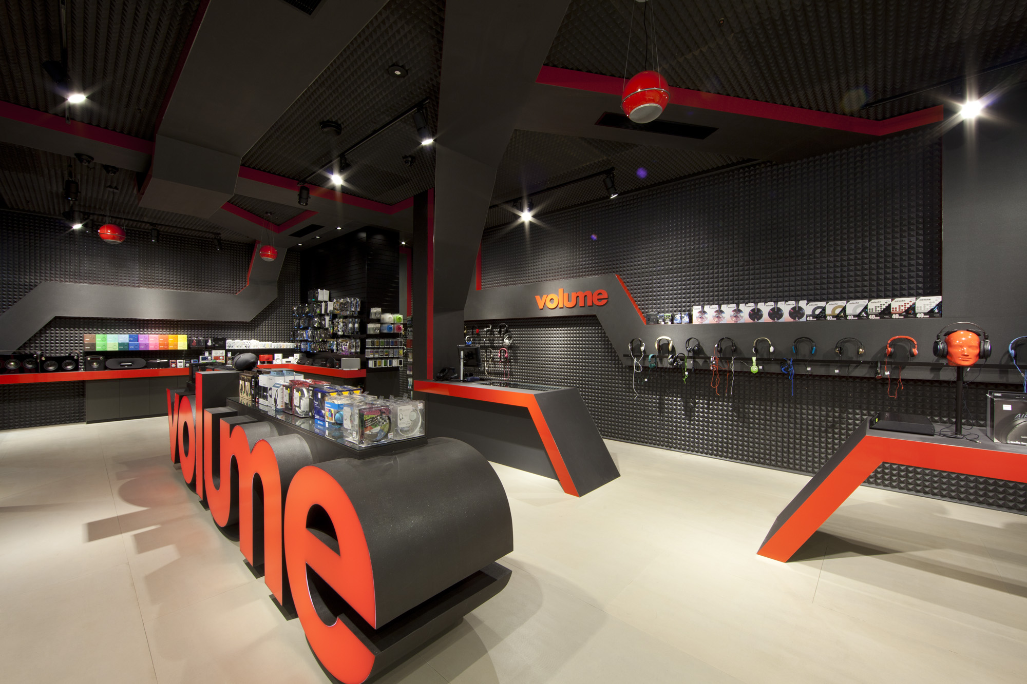
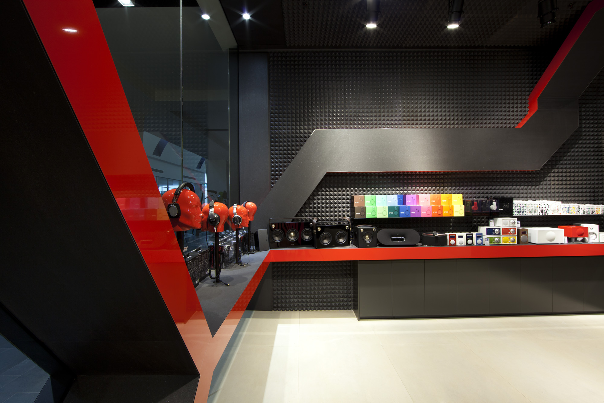
The glass providing transparency and intrigue, yet the ribbon adding structure and control of the space, the oversized logo functioning as an entry statement, counter and display surface.
Every aspect of this concept design reinforces the Volume brand.
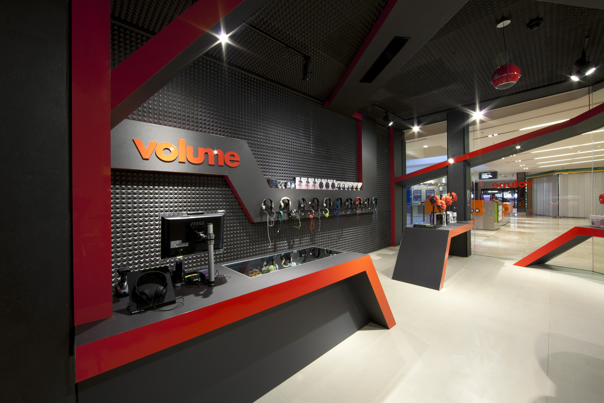
The aesthetic is dynamic and strong, with high colour contrast giving impact and clarity.
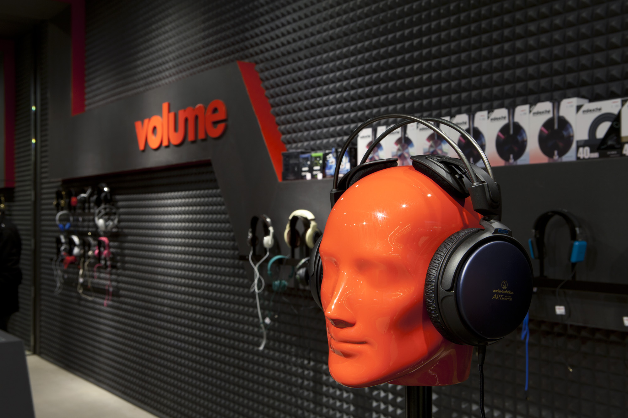
The red ribbon flows through the store wrapping the store front imitating sound waves, and the walls and ceilings are padded with acoustic foam mimicking a music studio to absorb sound waves and vibration.
One of the many ways Sandbox evolves space and place.
CLIENT
Volume
WHAT WE DID
:- Customer Insights
:- Brand personality positioning
:- Shopper profiling
:- Customer journey planning
:- Zoning and category planning
:- Interior design
:- CAD Documentation
:- Design management
:- Project management
STORES
Flagship concept
View featured projects from the folio:


