Gyoza Gyoza
NEW FIT-OUT FOR JAPANESE IZAKAYA-STYLE EATERY GYOZA GYOZA.
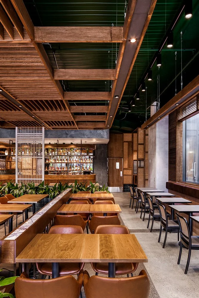
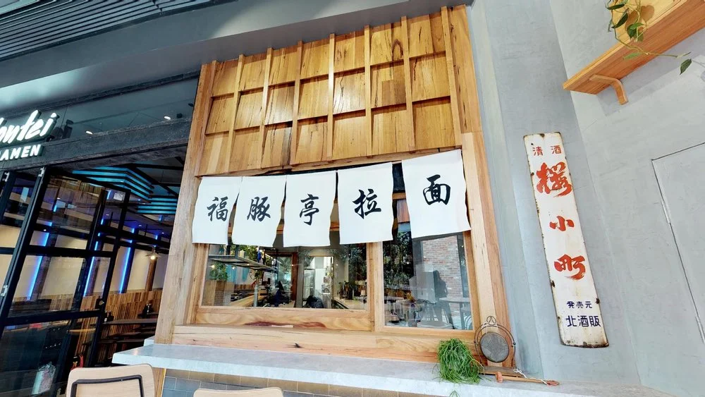
One of the most surprising things about travelling to Japan is discovering how diverse its culture is. There’s no shortage of the calligraphy-and-tatami-mat minimalism celebrated to the point of cliché in Australia’s sushi restaurants, but walking the streets of Tokyo or Osaka, you’re just as likely to end up snacking on tempura-battered fish or charcoal-grilled chicken skewers in a grungy hole-in-the-wall off a busy side street. These dining experiences are fast, tasty and exciting, so it’s no wonder that Melbourne retail designer, Luke Cannon used them as a reference point for their new fit-out for Japanese izakaya-style eatery Gyoza Gyoza.
“The real strategy here is to provide a unique experience that creates intrigue and allows local customers to see Japanese cuisine from an unfamiliar perspective.”
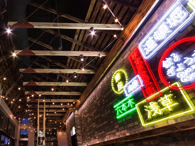
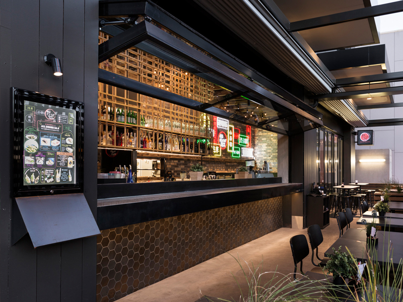
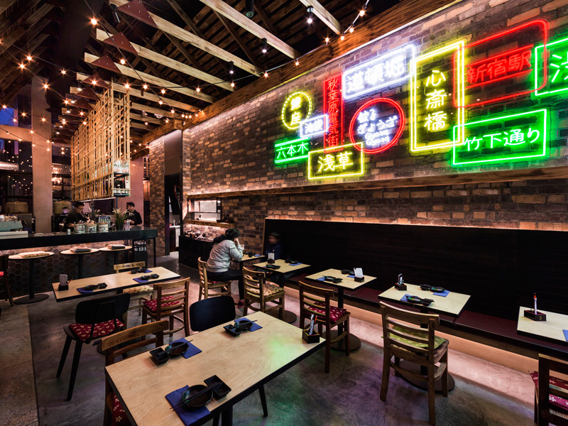
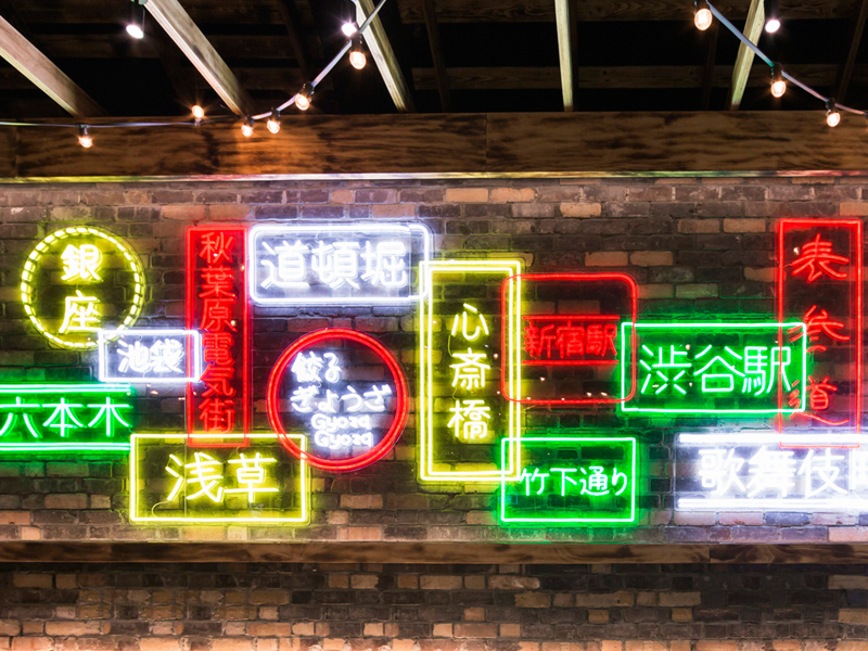
The restaurant sits on the outer edge of Westfield Doncaster, where it can’t rely so heavily on shopping-centre foot traffic, so Luke’s challenge was to make it an enticing destination that would draw patrons from within the centre as well as the surrounding area. A wall of neon signs inside the main dining space glows through the windows and out into the carpark, doing some of the work to attract passers-by, but as Luke says, “the real strategy here is to provide a unique experience that creates intrigue and allows local customers to see Japanese cuisine from an unfamiliar perspective.”
CLIENT
Gyoza Gyoza
WHAT WE DID
:- Customer Insights
:- Brand personality positioning
:- Shopper profiling
:- Customer journey planning
:- Zoning and category planning
:- Interior design
:- CAD Documentation
:- Design management
:- Project management
RESTAURANTS
2+
Flagship concept


